
Project Outline
Cycles Etc has been working with Trek to make cycling ownership more engaging. Their mission is simple: to help you love riding your bike. With an ever-changing demographic in a competitive landscape, they were looking to align their website with Trek branding and improve usability to cater to a more diverse group of cyclists.
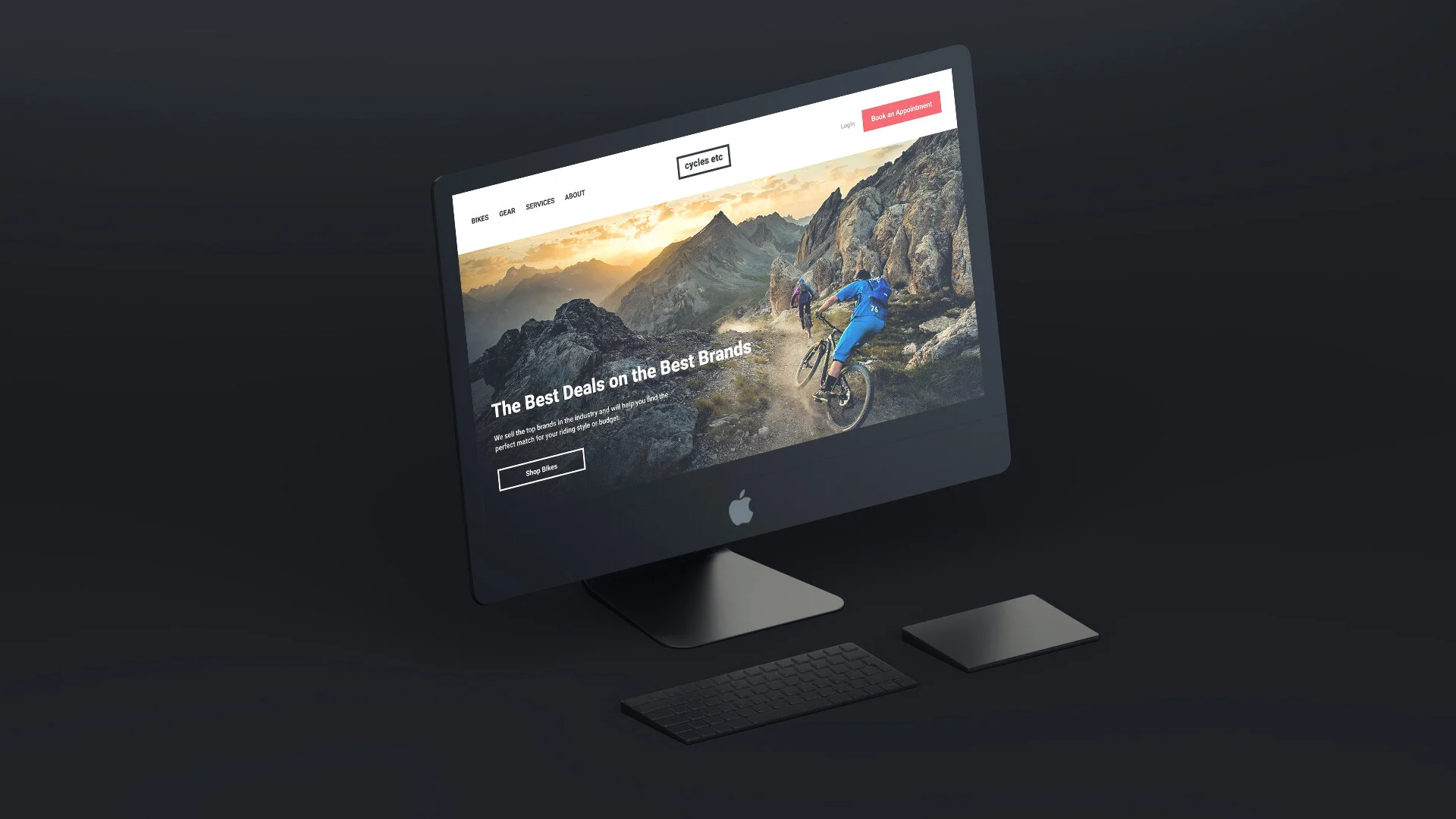
Trek | Cycles Etc
CASE STUDY

Role
Information Architecture
Art/Creative Direction
UX/UI Design
Tools
Figma | Miro
Discovery
Customer Needs
Local bike shops tend to serve the same basic needs of their customers: sell bikes and equipment and get them back on the road/trails when something breaks or needs service. This is done primarily with in-person interactions with the customers in the shop, but they usually invest in some sort of web presence to allow the business to be found. It was important to take a close look at how others were doing it in order to understand where there might be opportunities.
Competitive analysis was done to gain insight into where other brands were succeeding in providing their customers with useful interactions and helpful features.

Opportunities
The most prominent request from users was to have an online appointment booking feature that would allow them to schedule various service requests using their computer or mobile device. This feature is not currently available on their website, or those of competitors. This singular feature would motivate customers to make more frequent use of the website while offering a major convenience.
A secondary request from users was to be able to navigate the website without being overwhelmed with overly technical information or details, unless they chose to. This would involve presenting technical specifications for the various models and styles of bikes in a way that kept the user experience clean and uncluttered while still being comprehensive enough that they remained on the site, rather than abandon their visit to another site.
Who is Using the Website?
Understanding the customer base was crucial to providing the proper user experience. User personas were created to target who, and how, these users interact with the features on the website. This allowed an approach to providing what users would find most useful and to build cater to those needs.
Based on user interviews conducted with 4 customers, it became clear that the current website was serving a very narrow purpose. Most users discussed needing quick directions to the shop locations and finding contact info that would allow them to call and schedule a service appointment.

Explore + Define
Information Access
Tackling the second request first, it became clear that the way information (specs, details, technical information, etc.) was being presented on the site needed to be toned down. It was too much to digest when often times the minimum amount of detail was actually needed. So, a comprehensive look at the existing site map structure gave insight into how to organize the options so that users could navigate to what was important. This resulted in a drastic reduction in top-level navigation links and a cleaner approach to offering details on what the shop offered for products and services.

Back to Basics
The ability to book an appointment was directly tied to the frequency of visits and overall usability of the site, so there needed to be a clear path to accomplish this task. What information needed to be captured? What types of service were routinely being requested? How much time should be spent setting up an appointment? These questions formed the basis for the new appointment booking feature.

“I get overwhelmed with the specifications that my shop provides. I understand some people look for that, but it would be nice if there was a cleaner way to present it all for the more casual rider.”
— Participant 4
Develop + Test
Tune Up
A common issue with competitor sites pointed to an overcomplexity of performing tasks that would be utilized frequently, resulting in abandonment or diversion to another channel to accomplish what was intended. This was another opportunity to fine tune the processes for booking an appointment and retrieving relevant information on a product. Referencing previous research findings, an appointment booking system was created that provided all of the basic, high-level information that a customer would need while adopting a clean aesthetic that kept the focus on moving through the flow in order to successfully book an appointment for bike service.


Brand Style
The brand in place aligned with culture and provided a strong base to build from. With bold colors and imagery, yet a simplistic approach to the shop identity, a brand outline was established to match the current style while enhancing the overall look and feel.
A pairing of equally bold typefaces helped further establish the brand in a way that remained consistent with the initial design and kept the layers of information clear and legible. This approach translated into the logo exploration and low-fidelity wire framing.


Making it Work
All of the design elements focus on usability and initiating successful task completion with an emphasis on keeping it simple and allowing the functionality of the site to shine through. To test the design at this stage, high-fidelity designs were created along with a working prototype. This was integral in user testing the task flows to find areas for improvement and ways to optimize the user experience.

Participant Feedback
Clean look and feel of site
Appreciated the action photography
Moved into user flow; seemed drawn to appointment booking callout
Appreciated the detailed representation of the site and features
Liked the color scheme; felt like a bike shop
Thought the main logo at the top looked like all other buttons
Appreciated detail with appointment scheduling
Liked the information tracking when booking appointment

Deliver


16%
increase in bookings
11%
increase in sales
21%
increase in web traffic
18%
increase in registration
Down the Road
Cycling shops at the local level have been experiencing aggressive competition from Amazon and other “everything retailers” that offer cheap prices and seemingly endless inventory. But there are clear signs that the prospect of doing business locally is still a prominent factor in a lot of cycling enthusiasts minds.
A wide range of economic and social aspects of shopping for a product like a bike have changed in the past year, so there has been a resurgence of local businesses that have created a market for themselves based on the interactions that many customers desire for this type of purchase.
There are still opportunities to improve the usability of the website by adapting to shopping trends that involve a streamlined approach to organizing inventory and keeping customers in touch with what is new and upcoming.